From the documentary, ” Far our isn’t far enough” directed by Brad Bernstein, Tomi Ungerer as an artist used the metaphor of raping the paper by drawing & writing in order to give the paper new lives. This inspires me that each individual has different perception of drawing & writing, whether it is for fun, stress relief, self-satisfaction or career practice. They all have the same attitude as Tomi’s —the full respect of paper.
I have been trying to do sketching at various locations in Vancouver for quite a while. Bars, restaurants, bookstores, school buildings, and coffee shops are all great locations to gain experience, to interact with people. The publishing course gives me the opportunity to actually share where I sketch, what techniques I use, and thoughts behind those sketches. As a result, I made an appointment with one of managers, Ian Jamieson, from the Pourhouse. With questions such as how they reach customers, and present themselves through social media, I sat down as a interviewer with Ian.
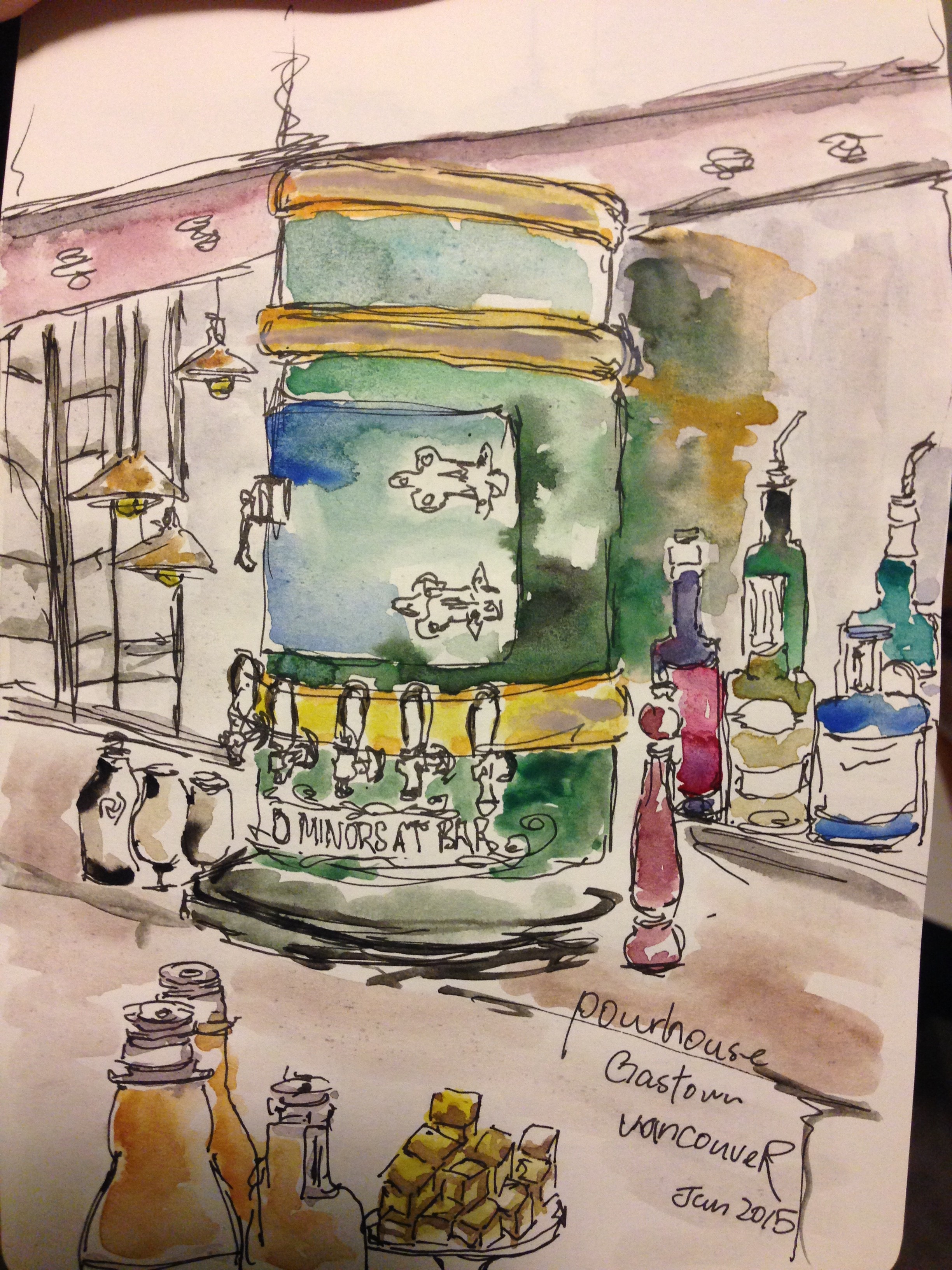
Location: Pourhouse, Vancouver
To start with menu in print, names of cocktails are not necessarily the focus to attract customers. Instead, they choose to use categories (in bartenders’ brain), for example, cocktails with stir (typically I would assume the traditional/ classic ones such as ‘old fashion’) & cocktails with shaken techniques. More importantly, ingredients of chosen would determine some alternatives of cocktails as well.
Social media use include twitter, facebook and instagram. The website also presents the live bands performing on Sundays, and the music played during the hours would be mostly traditional jazz and Mexicans’.
The sketch is done with limited watercolours, like many other urban sketchers’ work. The rough structure is located from up ceiling, middle bartender’s setting, to the bar table where I was sitting at. The key is to sketch something that could stand for a place’s identity, and in my case, the large greenish beer pool with a small front door is the unique representation of Pourhouse. Some selected shapes of bottles are sitting right beside it, where it wasn’t the case. Second point of sketching, I think sometimes, the items could be selected due to both the combination of drawing and limited space on paper. The trick is to organized in a way that makes sense to you, and you would really to enjoy imagining the way you organize in mind.
Only when sketchers want to show depth and shadows is the use of colours critical. In my sketch, the outlines of ceiling, for example, is followed by brown brush to show the somewhat 3D structure a little bit. The green storage is brushed with aqua green, burnt blue as close as possible to the real subject. Lastly, the real flexible part is among those bottles where I simply used all vibrant colours I had.